Case StudyTHE STORAGE GROUP
Designing an award-winning, modern and flexible rental platform.
The Storage Group needed a modern, flexible rental experience that could sell units and products together — without losing users in a frustrating, multi-step form
Overview
Doubling conversions and winning industry recognition through platform redesign.
The original rental platform allowed users to rent storage units online, but the experience was outdated, fragmented, and caused high abandonment. Users faced a long, inflexible form, couldn’t easily purchase add-on products, and lost all progress if they navigated away.
My role was to lead the product vision, redesign the customer journey, and direct the full platform rebuild. I focused on turning the rental process into a modern, flexible ecommerce experience while integrating previously disconnected tools and features.
Focus: Ecommerce UX, data architecture, customer journey redesign, design systems, engineering leadership
Scope:End-to-end product strategy, UX/UI design, platform redesign, agile delivery leadership
What I Did
I started by deeply reviewing the existing rental platform — how users were actually trying to rent units, where they dropped off, and why the current flow felt frustrating and limited.
What stood out immediately was that the platform was built around rigid assumptions: users already knew which facility they wanted and were only renting one unit. These assumptions were not true. The right functionality existed in pieces, but it was fragmented and caused high abandonment.
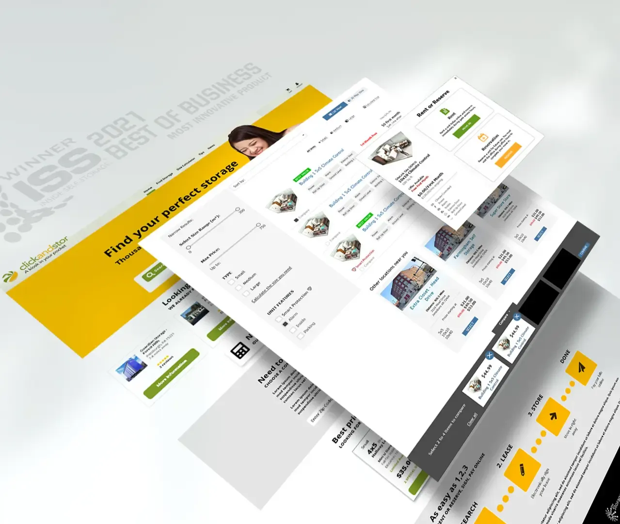
So the redesign focused on transformation. I led the shift from a traditional rental form to a flexible ecommerce experience. I redesigned the core customer journey, created a unified data model for rentals and products, integrated previously separate tools (space calculator and facility map), and built a persistent cart system that let users browse freely without losing progress.
The goal was not to simply refresh the UI. It was to fundamentally change how the platform worked — turning the rental form into a true platform, facilities into vendors, and storage units into inventory. This allowed users to search on their own terms and enabled aggregation of inventory across facilities or brands.
Gathering Insights
After reviewing usage data and conducting stakeholder interviews (clients, client managers, support team), I synthesized the core problems. Issues were grouped into major themes: poor discoverability, high abandonment during checkout, and the inability to sell ancillary products.
I used a data-driven prioritization framework (Task criticality × Impact × Frequency = Severity) to rank problems objectively and focus effort where it mattered most
Prioritisation of Issues
I organized findings into broader Epics to give engineering, product, and leadership clear visibility. This helped shape the product roadmap for the next 18 months.
The highest priority became rebuilding the core rental journey, as it was the largest source of abandonment and lost revenue.
Key Issues Identified
- Users abandoned the process when looking up facility information
- The system only supported renting one unit at a time with no support for add-on products
- Disconnected tools (space calculator, static maps) created extra steps and friction
- No effective way to recover abandoned rentals
Design Decisions
To reduce friction and create an experience users would intuitively understand, I studied best-in-class ecommerce patterns. I analyzed Amazon’s approach to cart persistence and checkout flows, and examined how retailers selling configurable or upgradable products (computers, phones, furniture) handled customization and add-ons.
By adapting proven retail patterns to self-storage, we made the journey feel familiar rather than foreign. Users didn’t need to learn a new system — they could rent a unit and add locks, boxes, or other products the same way they shopped anywhere else online.
I also considered the emotional context — storage rentals often happen during stressful life transitions. We kept the interface respectful and professional while adding subtle, purposeful animations and micro-interactions for positive feedback.
Wireframing the Solution
I developed practical designs informed by my development knowledge:
- Consolidated the rental process into fewer steps with a persistent cart
- Integrating the space calculator to directly recommend and link to bookable units
- Transformed the static facility map into a clickable, interactive surface where users could select and rent units directly
- Buildt smart abandonment recovery flows, including reminder emails that preserved user progress
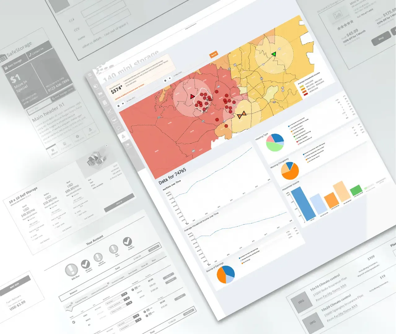
Low-fidelity wireframes were used early to test flow and gather feedback from stakeholders and users.
Validating the Solutions
Usability testing sessions with stakeholders validated the new approach. Participants completed realistic tasks such as finding storage, adding products, and completing bookings. The tests showed major improvements in speed, clarity, and completion rates.
These tests helped refine the designs before moving into high-fidelity mockups and development.
Engineering the Product
I created high-fidelity mockups and interactive prototypes to define the complete user interface and interactions. I worked hand-in-hand with front-end and back-end teams throughout development, participating in daily standups, running regular design reviews, and maintaining constant communication to ensure technical feasibility and design integrity. This included:
- Breaking down features into sprints with clear acceptance criteria
- Specifying complex interactions that weren’t fully covered in the mockups
- Conducting UX reviews on each front-end ticket before it was merged
- Working with backend engineers to align data structures with the new user experience
This collaborative approach minimized rework and helped maintain a high level of design quality as the platform was rebuilt.
Results
The rebuilt platform delivered strong results for both users and the business:
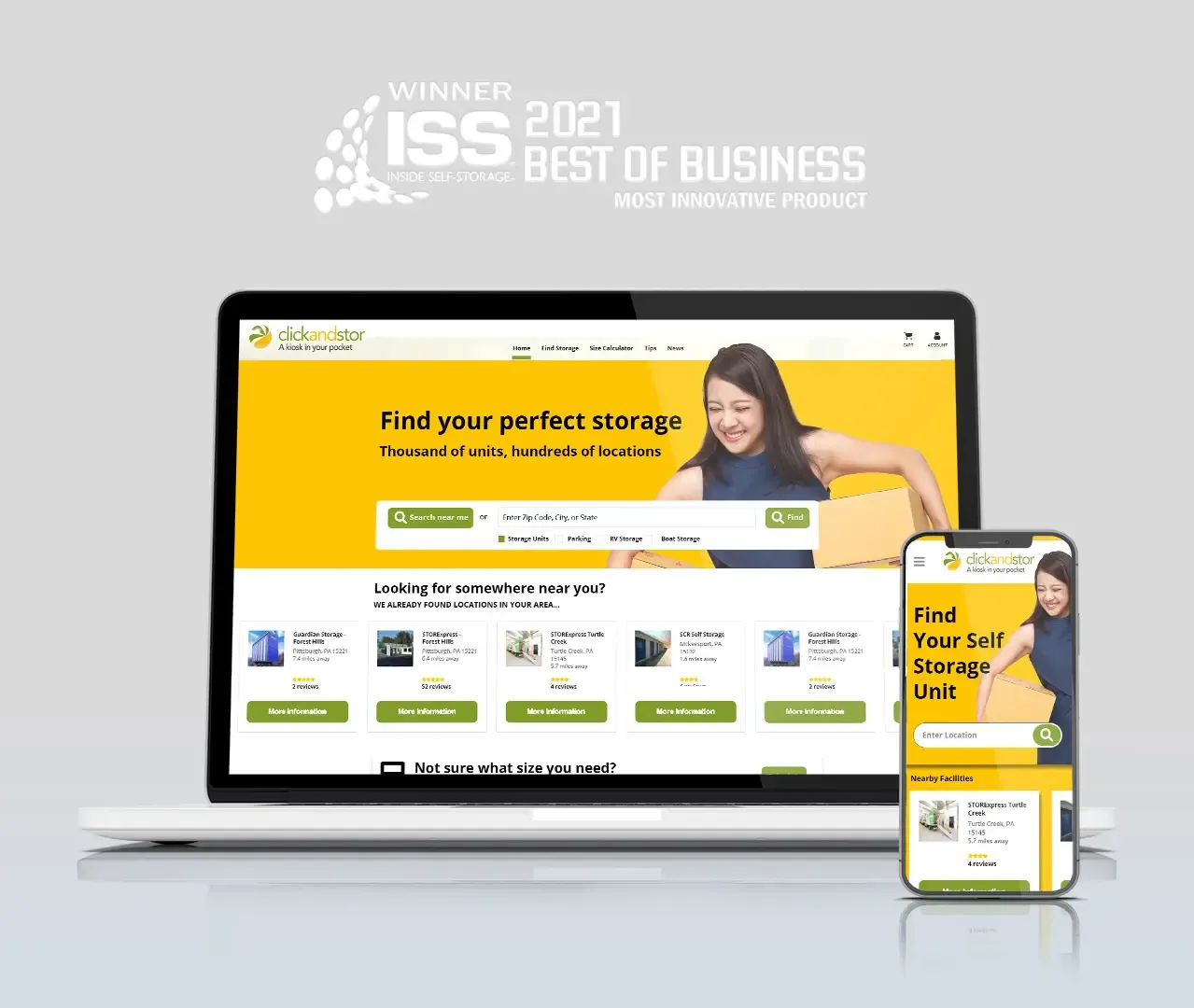
- Won the ISS Most Innovative Product Award
- Doubled rental conversions
- Reduced customer support tickets by 4x
- Delivered approximately 20x month-on-month ROI improvement for clients
- Significantly lowered abandonment rates through the persistent cart and improved user flow
- Created a scalable, future-proof system that enabled inventory aggregation across facilities and support for additional services
Key Takeaways
This project showed the power of questioning assumptions. What looked like isolated problems were symptoms of an outdated paradigm. By reframing storage rental as modern ecommerce, we built a platform that was both more usable and commercially powerful.